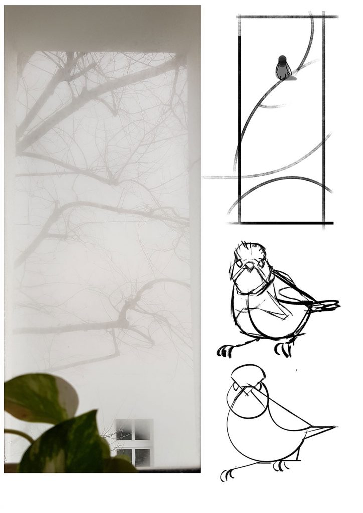
Sometimes “inspiration” really just means to look at something you’ve seen already multiple times again, but this time you see something different.
As I got out of the shower I looked out the window which had fogged up due to me enjoying warm water on my skin while we had just seen some snow coming down a few minutes earlier. The view out of the bathroom window isn’t very inspiring by itself, there’s the wall of the next house a few meters away and some branches hanging from a tree which sits between the two houses. I’ve seen that view for 3 years on an almost daily basis and I don’t get excited about it, usually. However for some reason this time my brain made me realize and actively consider that there is a wall, and yes there are tree branches – but have you noticed how everything looks like it’s 2D. It’s all flat, there’s no volume to it. Whatever chemistry happened in my brain at that point took those thoughts and turned it into multiple ideas for artworks.
This was one of the ideas and the most straight-forward one. So everything you need to know is already in the first image here. The ref-photo I took a couple minutes after the post-shower-epithany and the quick composition doodle that followed after.
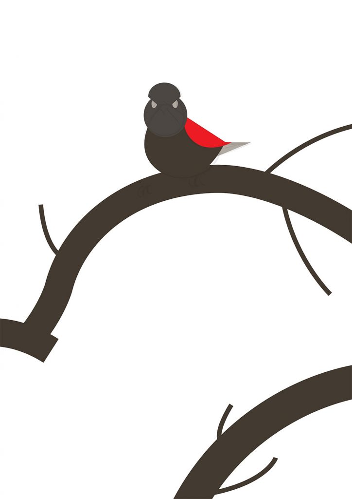
I knew I would be going for a simple composition and color-theme on this image. Mostly bright greys to give the impression of mist & fog, but with a little bit darker values on the branches and the bird. I knew that I’d need a bird with a colored pattern to it’s feathering and looking through the bird guidebooks I found the “Balkan-Bartgrasmücke – Subalpine Warbler”. I liked the red’ish chest coloration but ultimately I decided to use this bird because I saw an opportunity in its head-shapes.
So the next step was to lay down the base-shapes without any detailling.
You’ll see that nothing major changed after this. I changed some of the angles on the branches, I also went back to a rectangular stilization of the wing similar to what I had put down in my very first sketch for the bird itself. But other than that the next step was to adjust the colors closer to what I would need to build the final image on.

Then I just drew the rest of the picture. The biggest change was at the end when I decided to go with mor cool colors instead of the warm-greys I had used for the blockout, but that was done with a simple photoshop-curve adjustment after the detailing was done.
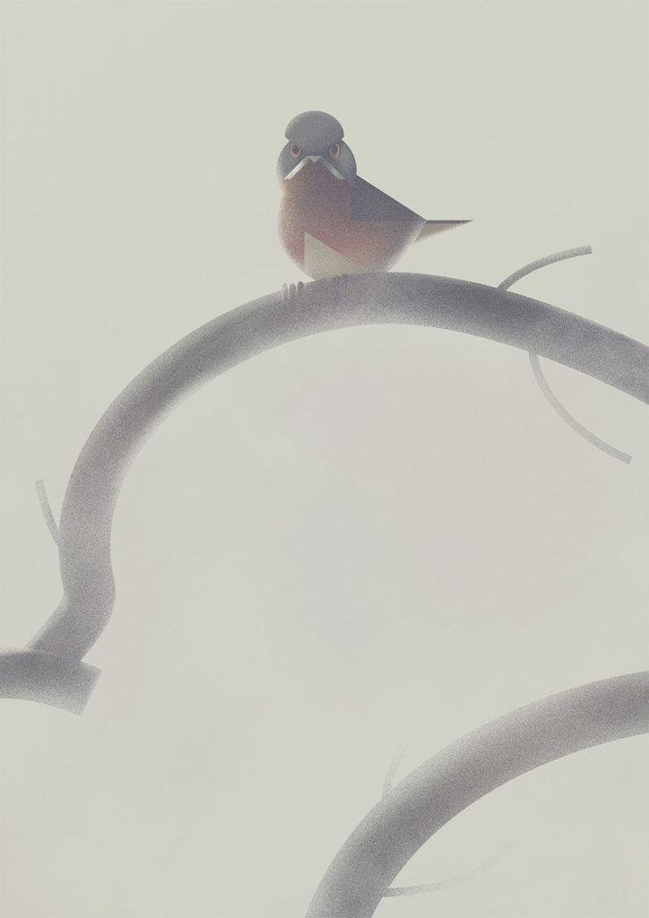
And that’s it. It certainly isn’t the most complex artwork or composition, but it also doesn’t need to be.
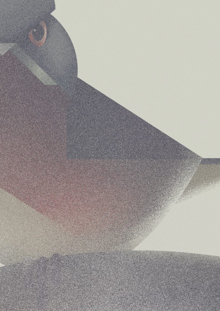
Last but not least here’s an image showing how the artwork looks at 100% zoom – or close to it due to rescaling happening in the blogpost.