Category: Process
-
20240423

-
20240312
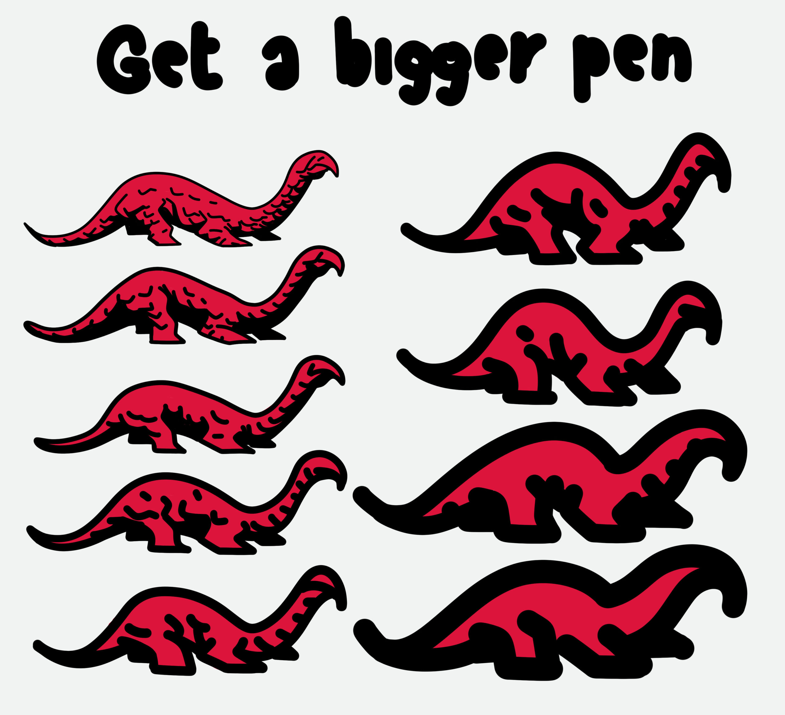
This is a simple drawing & abstraction exercise I call “Get a bigger pen”. It originated from a logo-design course while I was studying Communications Design when the professor took away my micro pencil and handed me a chunky piece of crayon instead. Try to draw the same thing with increasingly bigger brush sizes. And…
-
20240227
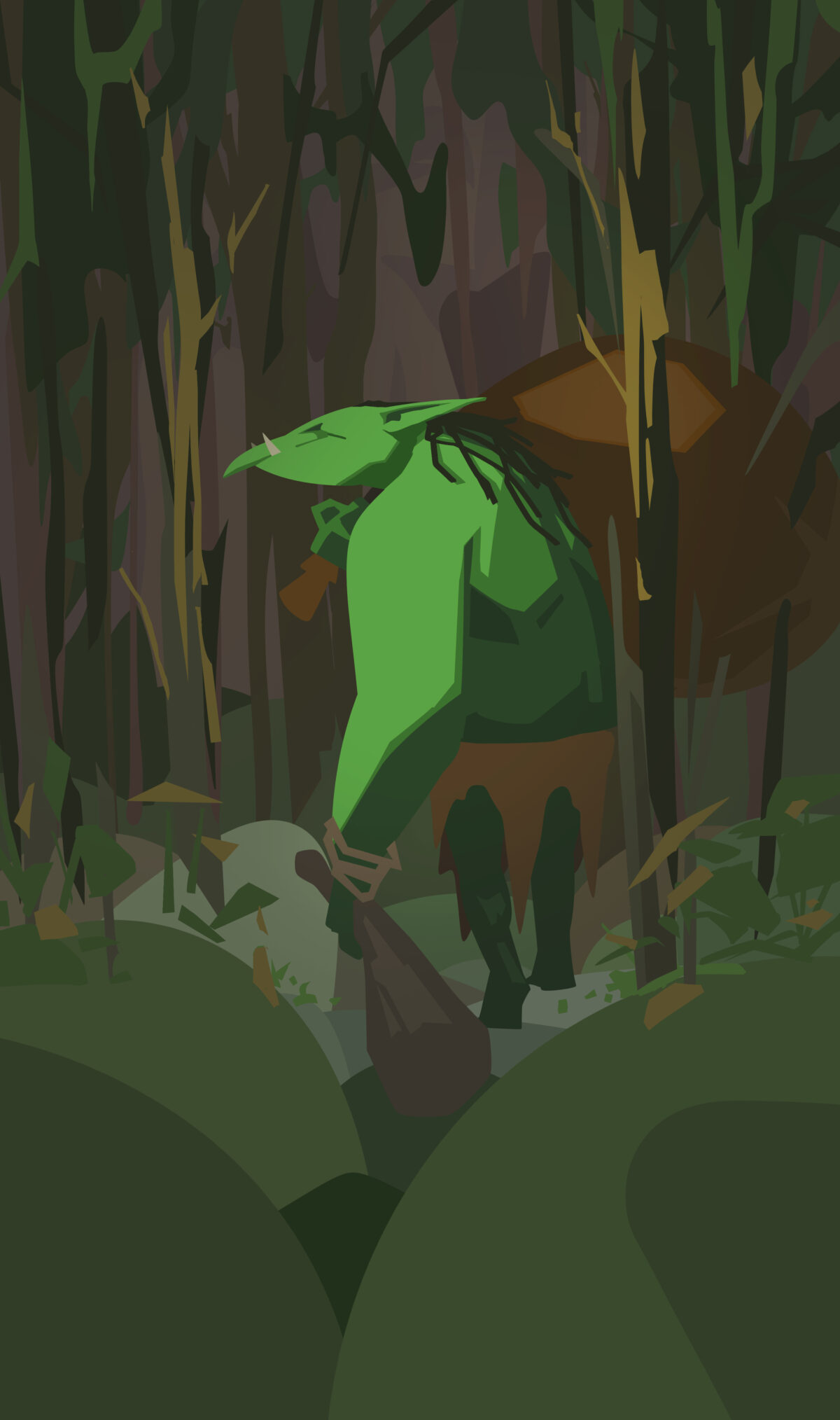
I’m thinking about buying myself a print of some Ivan Bilibin art, so his art was on my mind at the time when I started sketching.As usual lately, I’m exploring the scope between figurative and abstract art.
-
20240226
This is fun
-
Cardgame idea
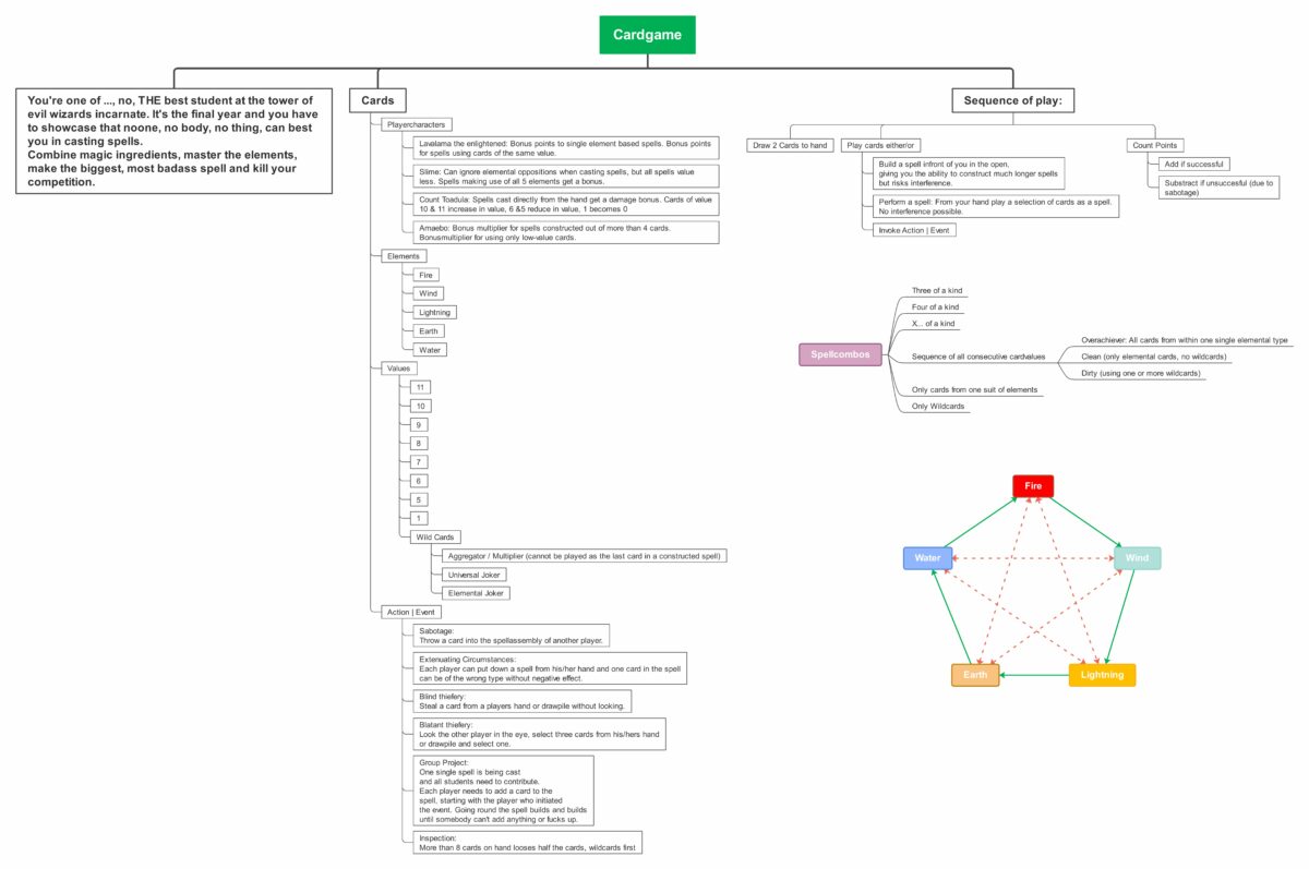
I’m experimenting on another song but had this idea for a game that I quickly needed to put down. I guess it’s a mix of Canasta, Rummy & Uno. You’re a student in the final year at the tower of evil wizards incarnate. You have to craft spells together and against your fellow students and…
-
Silly project: brainstorming

This morning, while waiting for job feedback, I streamed ~2 hours of just throwing thoughts on a canvas and creating a mind map for a silly project. Since the video isn’t that interesting, here’s just the current status of the mindmap. There’s no guarantee I’ll make this into an actual project; I simply enjoy the…
-
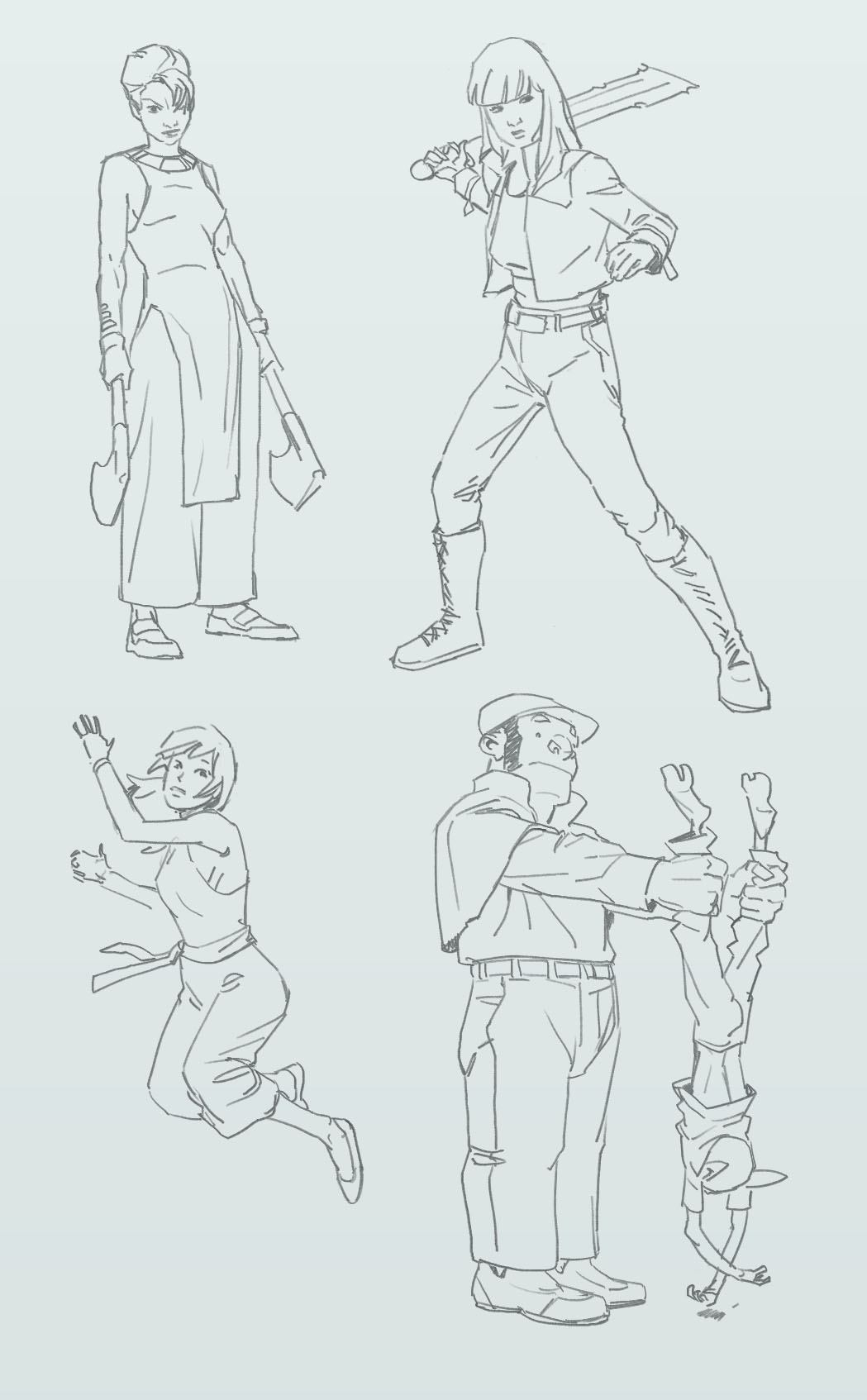
20231025
-
20231023
-
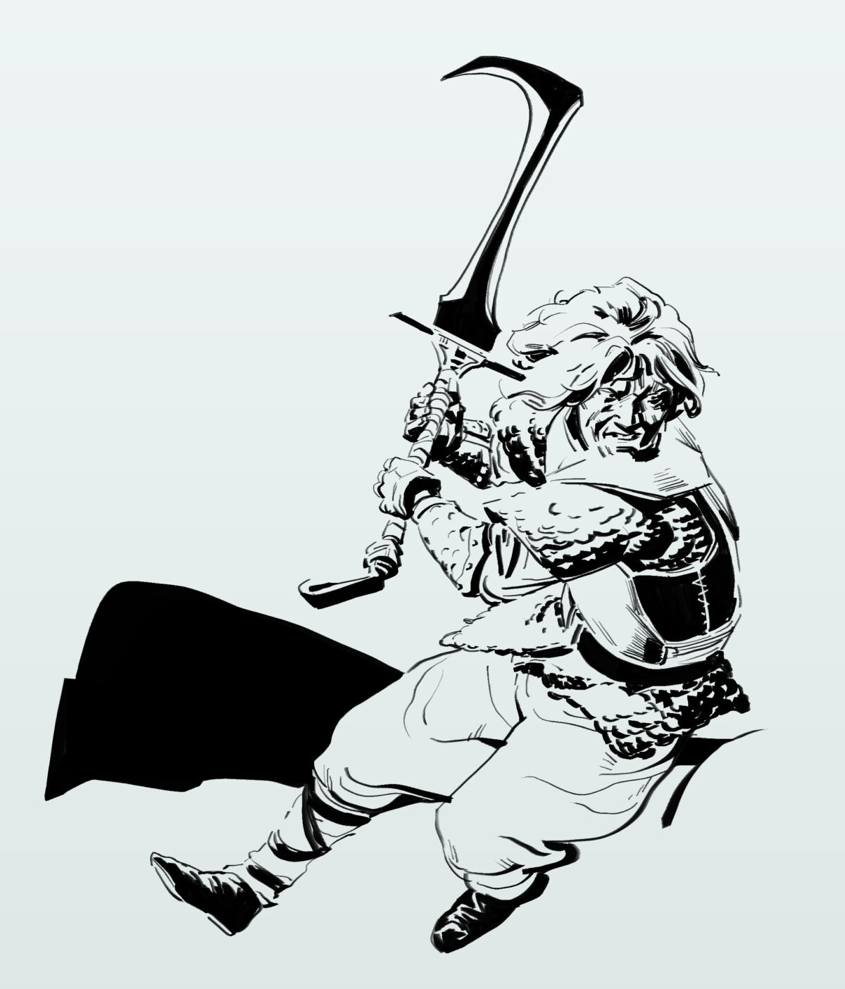
20231020_01
It feels like today will be a “meh” kind of day. Dark, grey, moist, windy… miserable, dispiriting. I think I’ll bake some cookies to lift the mood and then probably draw a bit again later.
-
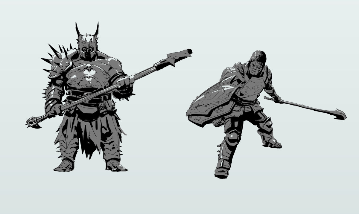
20231019 2 & 3