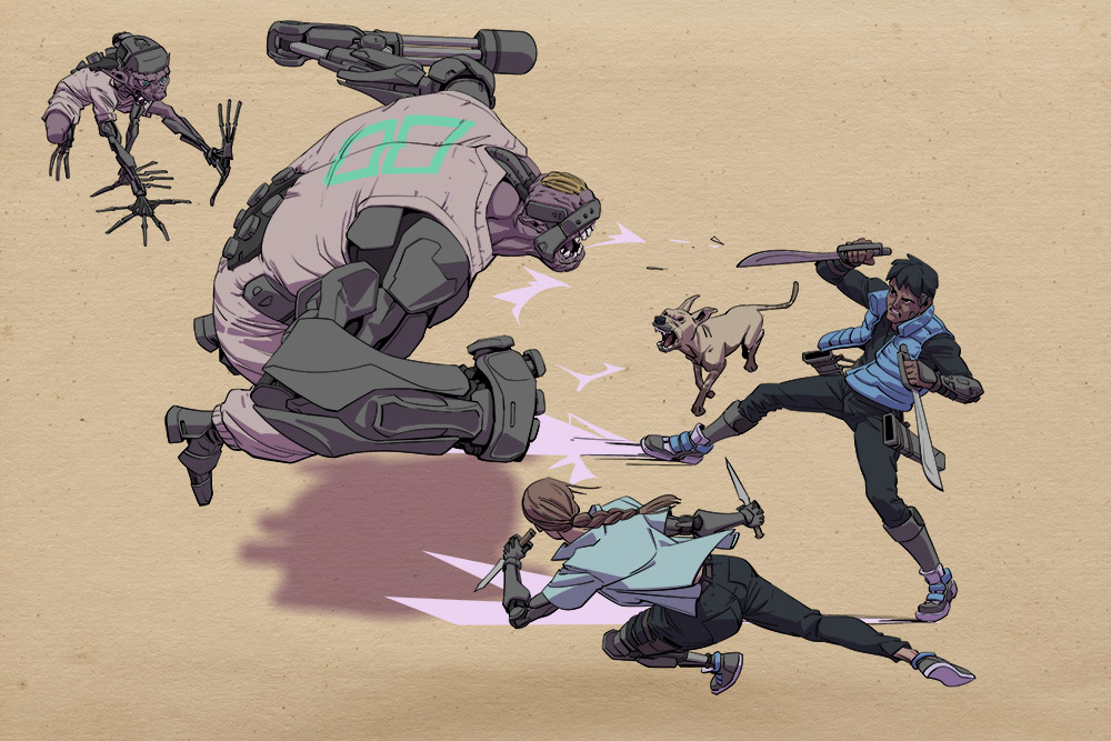
I’ve noticed I sketch more freely when I put some texture on my canvas. This texture though I’ll probably not use again.
I’m always going through books, albums, and other things – here’s what stuck lately:
I’ve noticed I sketch more freely when I put some texture on my canvas. This texture though I’ll probably not use again.
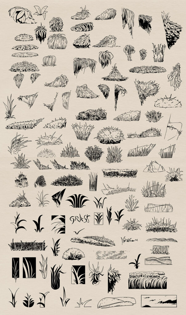
I spent some time every day for a few days drawing and abstracting grass.
I’m going to attempt to write stuff every now and then. It’s going to be rough. Read at your own peril.
Read time: ~3-4min

Monastery
So many lives were lost. What was left of their hope was little more than embers. After days, who knows how many, of unending pounding by this storm, they were the only two left.
Their expedition had started with 72 people; only them, the two who started this disaster, remained. And he had thought they were going to die as well. Had been sure of it more than once. When the rope connecting him to Nathanial had slackened, he had been certain that he wouldn’t be able to raise Nathaniel back up again when he reached him. He could barely keep himself up after all.
Damn this cursed storm. It appeared out of nowhere. This tempest blanketed a clear blue sky and replaced perfect weather with unending desolation. Thick, soggy snowflakes are whipped about with more force than their weight should allow. Each flake feels like wet leaves clinging to your clothes, like tiny hands that try to drag you down into the muck. And whenever they meet skin, they bring the sensation of small sharp biting pincers that burrow into the individual pores and attempt to tear it inside out one pore at a time. They are carried by a harsh freezing wind that never lets up but is never steady enough for you to adapt. Gusts of wind that throw pinpricks of ice under your hood. Bursts of air that entrench frozen barbs between the layers of your wrappings until your movement causes their spikes to scrape their way to your flesh, where they prick into you like thorns. Each sting introduces more coldness and relieves you of more of your fleeting energy. But also, there is that slight relief when the needle pierces, and the flesh heats in response. The small comfort of a droplet of blood leaving the confines of your body, relinquishing its warmth onto the surface of your unfeeling meat.
Curse this damned storm. And now this.
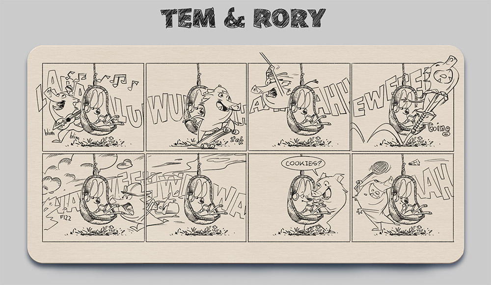
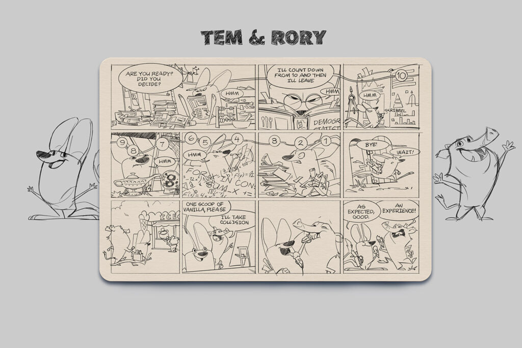
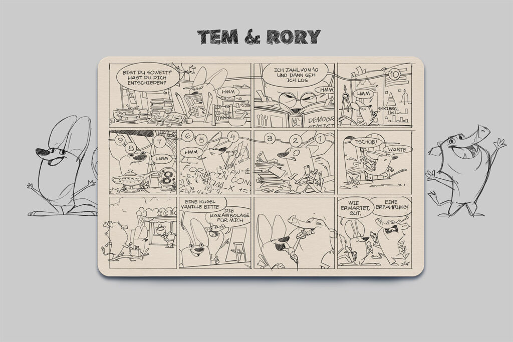
I recently made some character-doodles based on the >>Garden Dormouse<<, which is the animal of the year 2023.
Also recently my wife and I talked about a Healthy Gamer episode in which “indecisiveness” was discussed.
Then I decided to try to combine the doodles with the topic of discussion and turn it into it’s own thing.
English
Deutsch
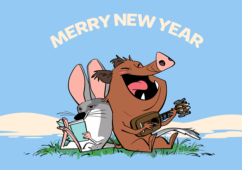
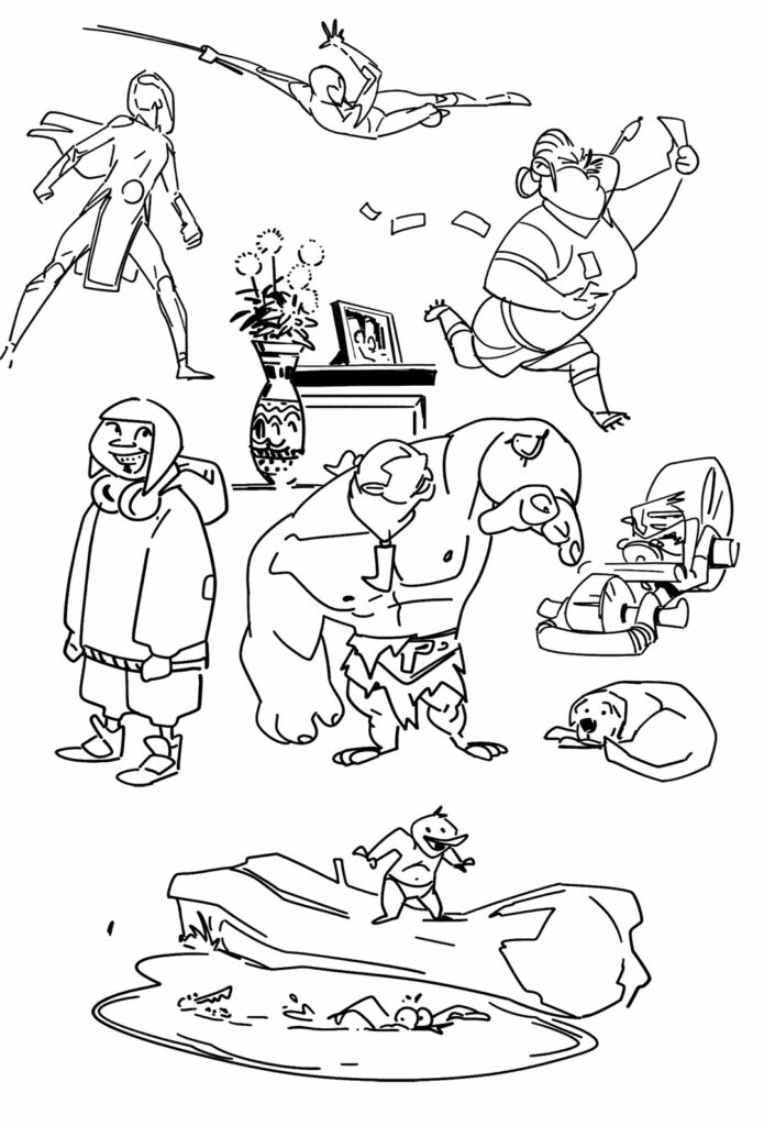
2022 was a tough year. Hopefully, 2023 will be better. I’m working towards being able to draw again.
First doodles I have done since November 2021.
On instagram I got asked to show more of the style exploration.

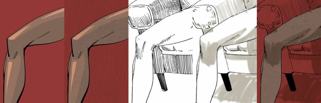
I’m not going to show the full erotic drawings I made, but to provide a little bit more than just those detail shots I made slight variations of one drawing. On purpose, I only changed what photoshop-brush I used for the drawing and slightly altered the way I drew the image. This is nothing special, I just did it in the context of Lars’ request.
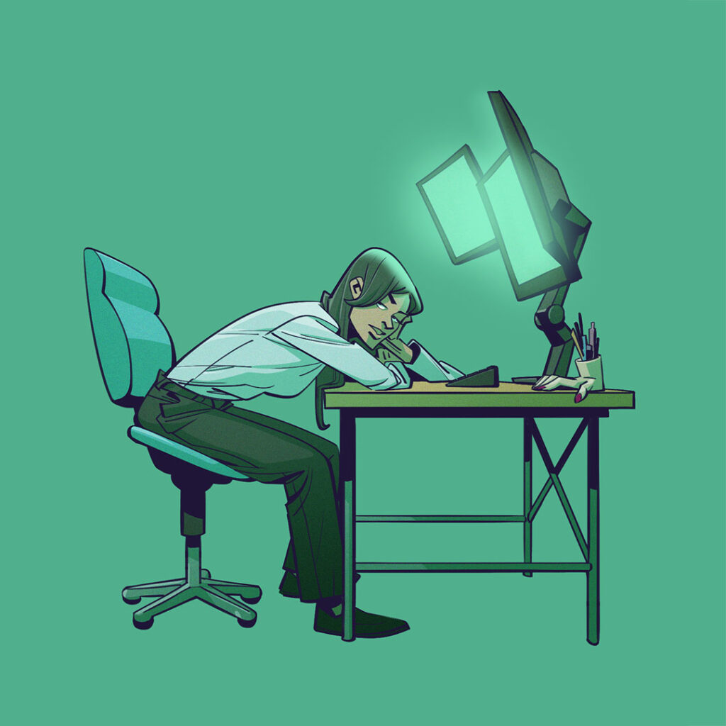
This is similar to the drawing that kicked off the exploration I mentioned in yesterday’s post. To me, that looks very digital. Very clean lines, no open ends, solid black fills, all lines drawn with massive smoothing on to make sure there are no bumps/shakes in it. A little bit of sharpness and angularity to the drawing. The pen pressure/line thickness is spiking rather than increasing smoothly. The lines are drawn fast and fluidly.
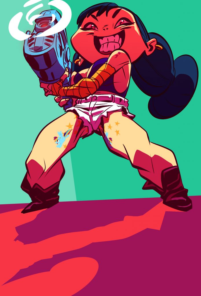
I do like this style in general, and I think it goes especially with something a bit more exaggerated. And maybe that’s why it felt so wrong because the drawing of a woman I did, wasn’t exaggerated. Here are two examples of when I utilized the same brush/drawing execution in the past but pushed further than I did here.
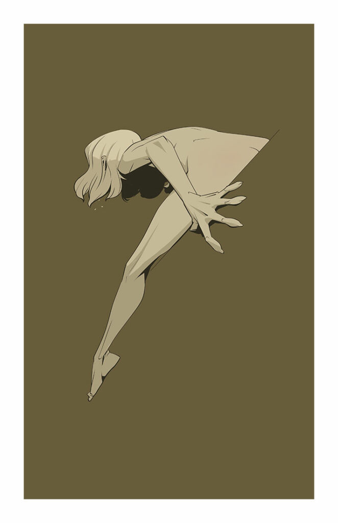
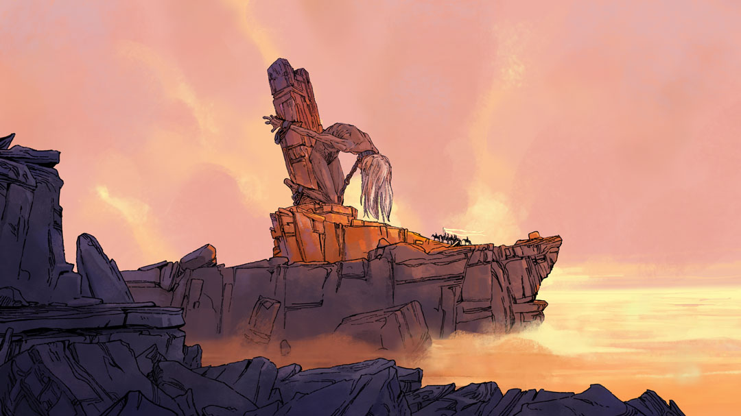
This is similar to how I drew the fantasy scene I posted yesterday. I used a photoshop brush that leaves a little bit of a breaking line. I did not use any line smoothing. The lines are drawn more slowly to let jitters show when they happen and due to the way the brush is set up, I had to use very little pressure when drawing to retain the brokenness of the brush. Because of that all the angle changes appear just a little bit softer than in the previous drawing (it’s most visible in the clothing folds). There’s also little to no shading done with the line itself, that has to come via the coloring. Since I had a worked-out sketch underneath these drawings I would say there’s a lot less “searching/questing” done in this drawing than I did for the previous fantasy scene.
I don’t like the look I created here, so this is something I will explore further in the future.
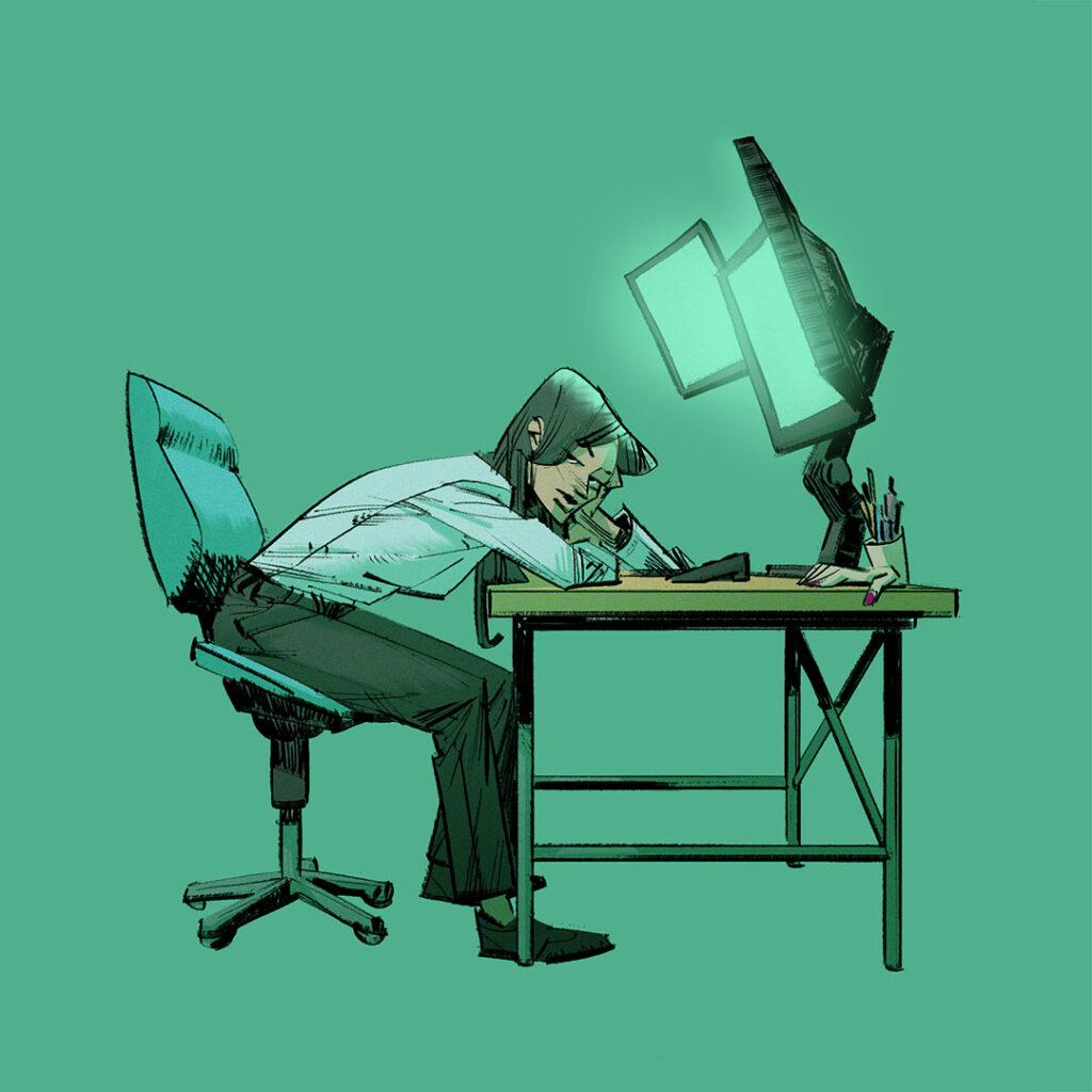
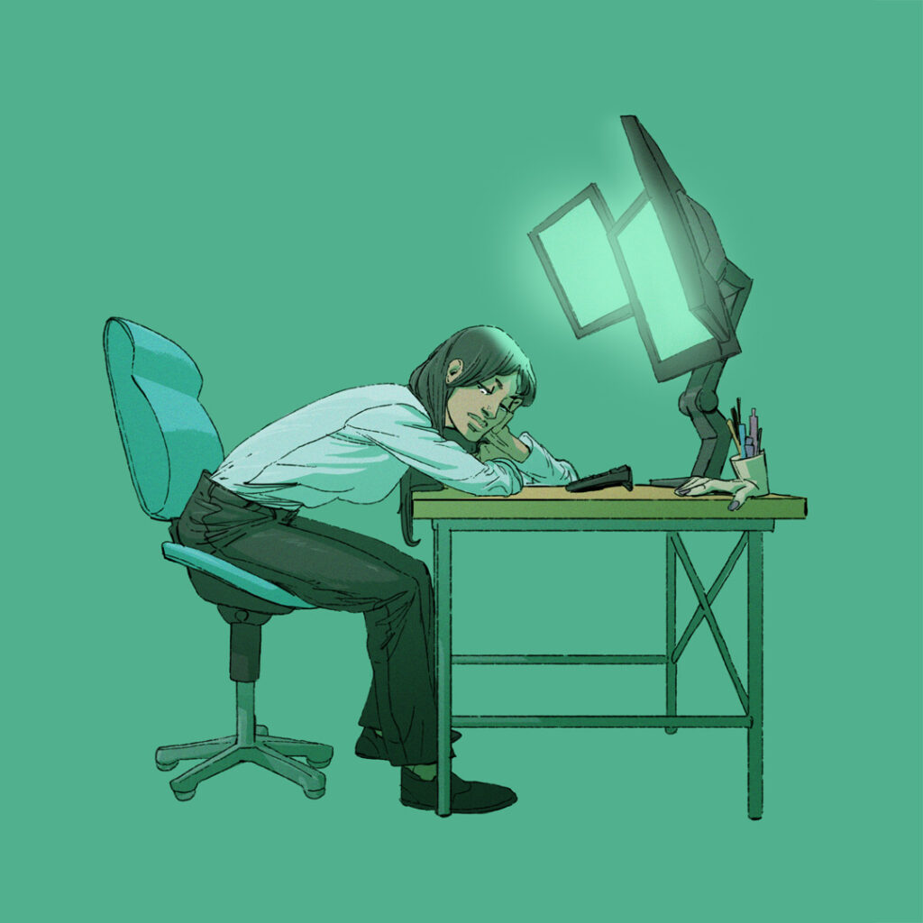
This third one I made using a “dry ink brush”. Its basic shape is similar to the brush that I used for the first drawing, but it has a bit more texture. I utilized a little bit of smoothing and drew everything very impatiently. That led to hard edges, hard angles, sharp lines, toothy texture and sometimes linethickness variation that isn’t “perfect”. It’s leading to a look I haven’t really explored all that much because I just need to look at Sean Gordon Murphy’s inkwork and then what’s the point of doing anything anymore.
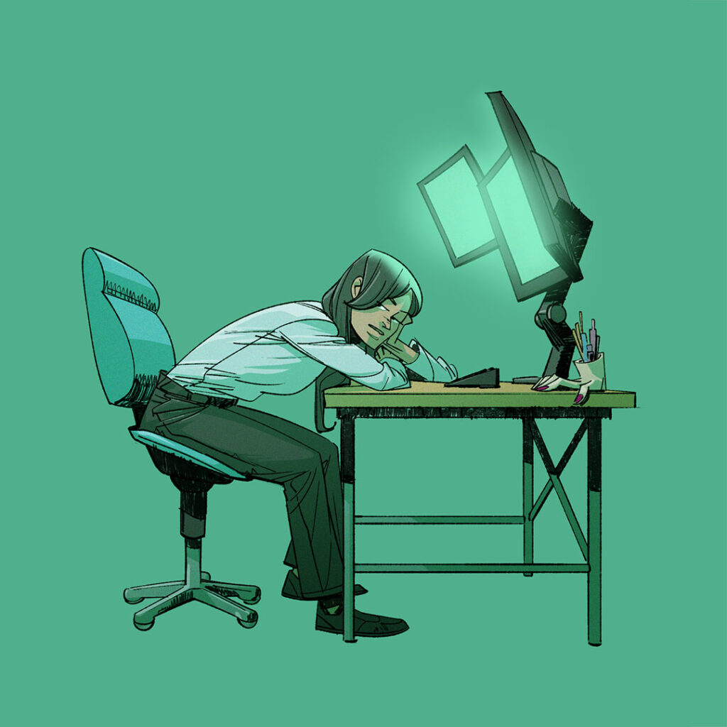
I was using a solid line brush with just a tiny bit of texture to it, using medium line smoothing for the fundamental drawing so I get relatively smooth, even lines. Because that looked to clean (and digital) I altered the brush settings slightly to show a little bit more texture, turned of smoothing and filled in the blacks with very fast, short lines and left spaces unfilled. This adds just a little bit of an “analog” feel.
These differences can certainly be pushed quite a bit further. Especially when you add proportion variation or vary the coloring process. But that wasn’t my intention for these versions.
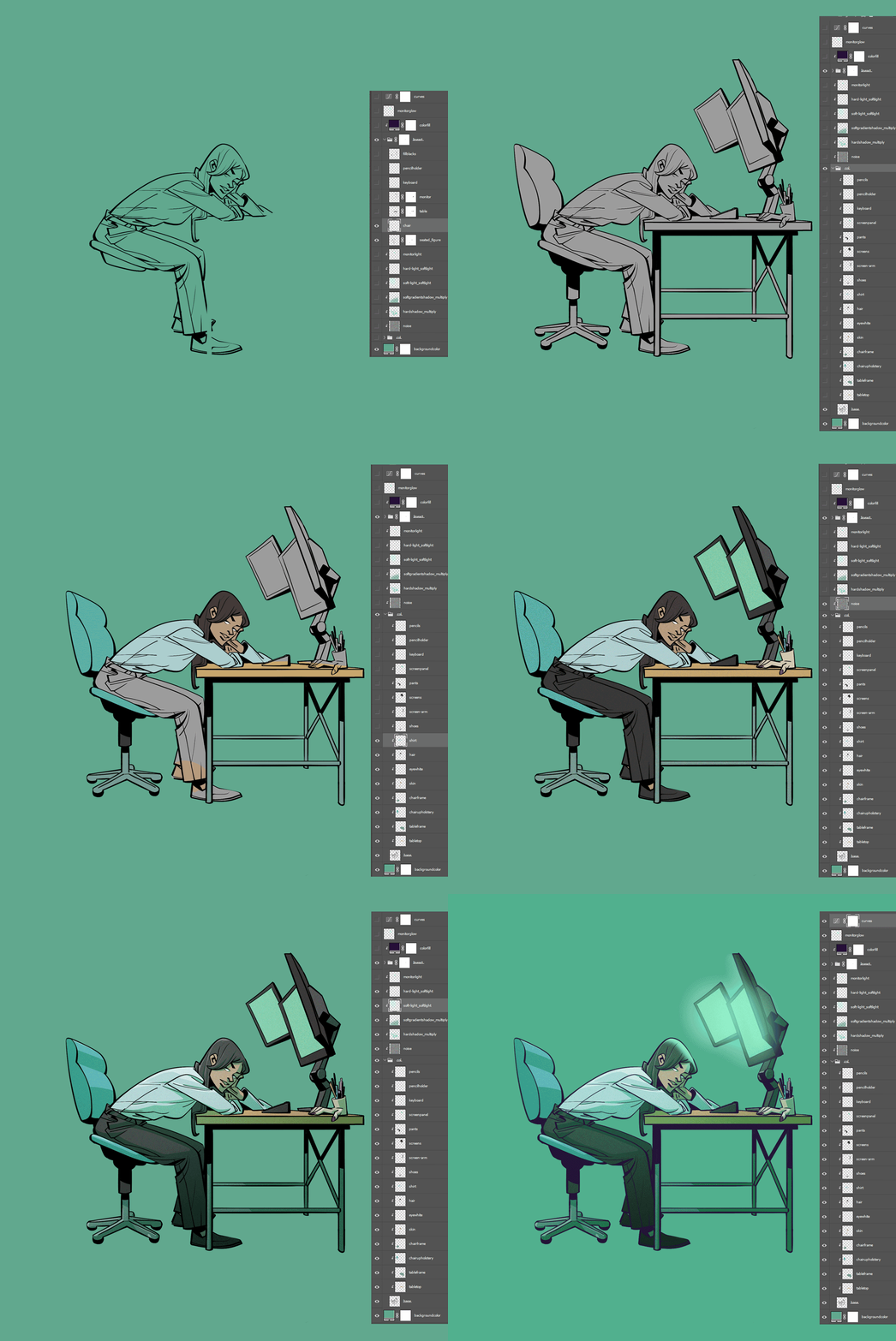
And for last here is a gif that shows the file setup. I don’t think it shows anything special, but maybe some person finds it interesting nonetheless.
Sometimes I wish I could just settle for a “look” for the stuff that I create. But it’s just not going to happen I guess. I’m still exploring how images can look utilizing lineart and “coloring inside the lines” and I never like what I do long enough to make it a distinct thing.
The week before I was doing some erotic drawings. This time unfortunately I didn’t like the cleanliness of smoothed, pixel-perfect lines and crisp cell-shaded coloring. To alter that impression the first thing I tried was to simply throw a paper texture on top and add some noise. This time such quick fixes only added to my annoyance. So I modified one of my favorite sketching brushes to look like a little broken bleeding pen nip and restarted my drawing from there. I did a couple more drawings using that brush, experimenting with different methods of coloring them, the length of my strokes, whether or not to use it with lazy nezumi/photoshop stroke smoothing, and then let it sit for a few days.
This week I decided to pick up the exploration but instead of drawing naked woman I decided to go for a fantasy scene. I didn’t use any brush smoothing and instead of making designed marks and lines I decided to “doodle” a lot of the linear details. I looked at Moebius art, Lorenzo de Felici, Sergio Toppi, Mark Nelson, Jonathan Edwards, Jorge Zaffino, Ashley Wood – not that it shows. I painted the background using brushes from Dice Tsutsumi, Greg Rutkowski and Justin Gerard because I wanted “texture”.
While I enjoyed it while I was doing it, I’m now already thinking that it’s too random. Not designed enough. The line thickness is too uniform. The perspective is too boring, the scattering of the details too equal. The coloring seems to be in limbo between full flat color an volume based painting.
On to the next thing I guess. The learning continues.