Month: January 2023
-
20230131
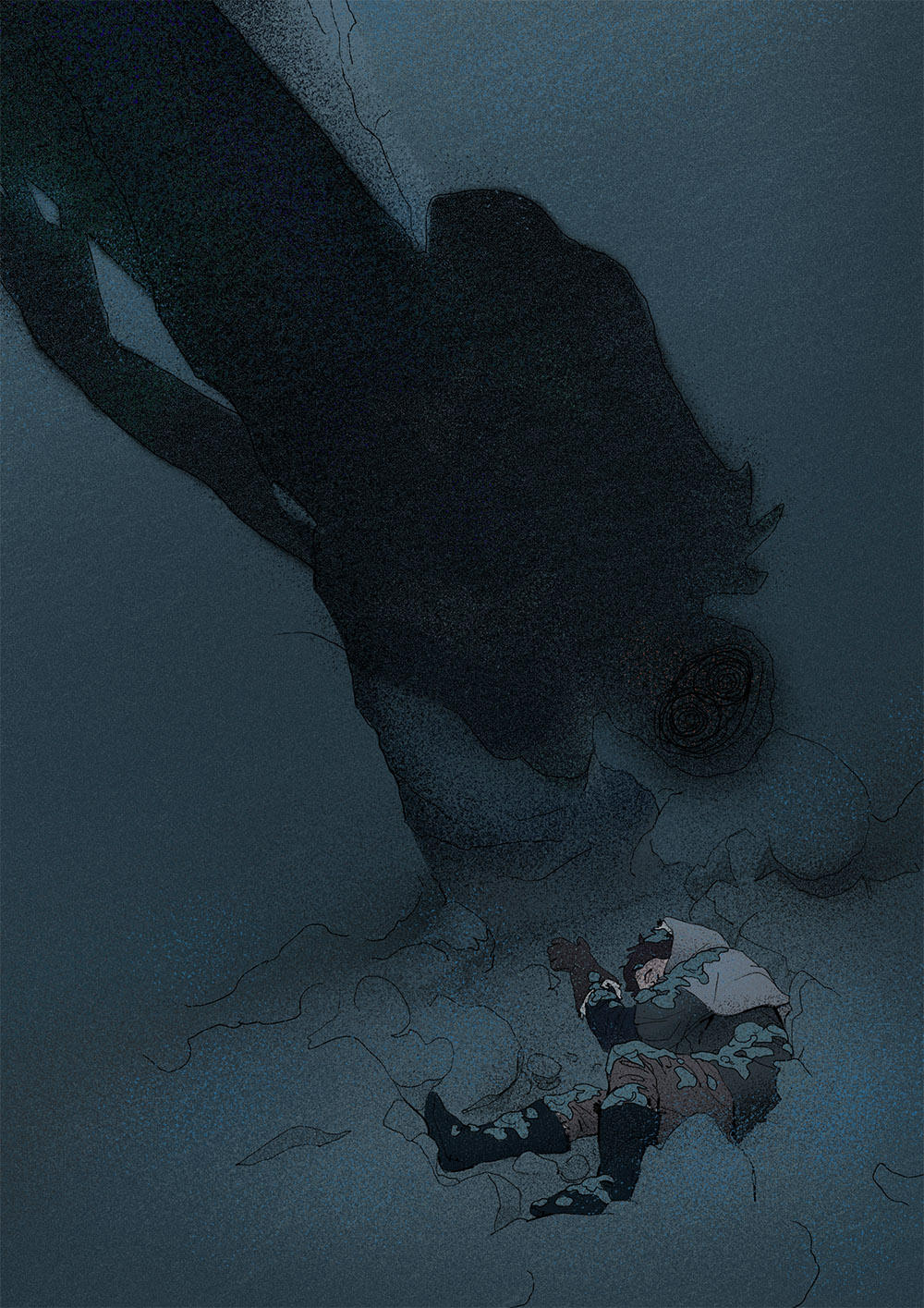
Two less complex experiments using noise/texture to break up the digital feel. This one I consider a fail. The idea was to have a man kneel in front of a woman, head resting on her legs. I was attempting to convey solemnity, solitude, loss, and hopelessness. I wanted the darkness to creep in, the outside…
-
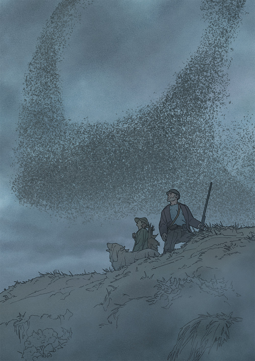
20230130
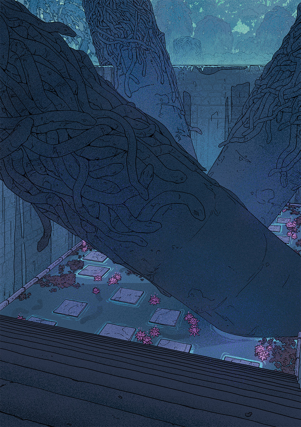
This image started with me not knowing what to draw. Like many artists, I have folders upon folders of inspiration saved on my hard drives. Some are artist-specific, some are themed, and some are just random images I found and liked but was too lazy to sort. This image started by looking through one of…
-
Stuff I like: Comic – Betty Boob
Betty Boob is a comic told with almost no words. The drawings are expressive, sometimes a lot of fun, sometimes conveying heart-crushing sadness – beautifully written by Véro Cazot, and illustrated by Julie Rocheleau. Betty Boob is the protagonist of the comic; she’s been diagnosed with breast cancer and lost her hair and her left…
-
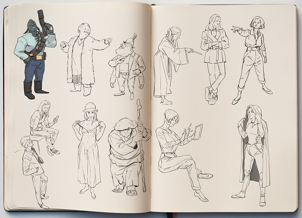
20230127
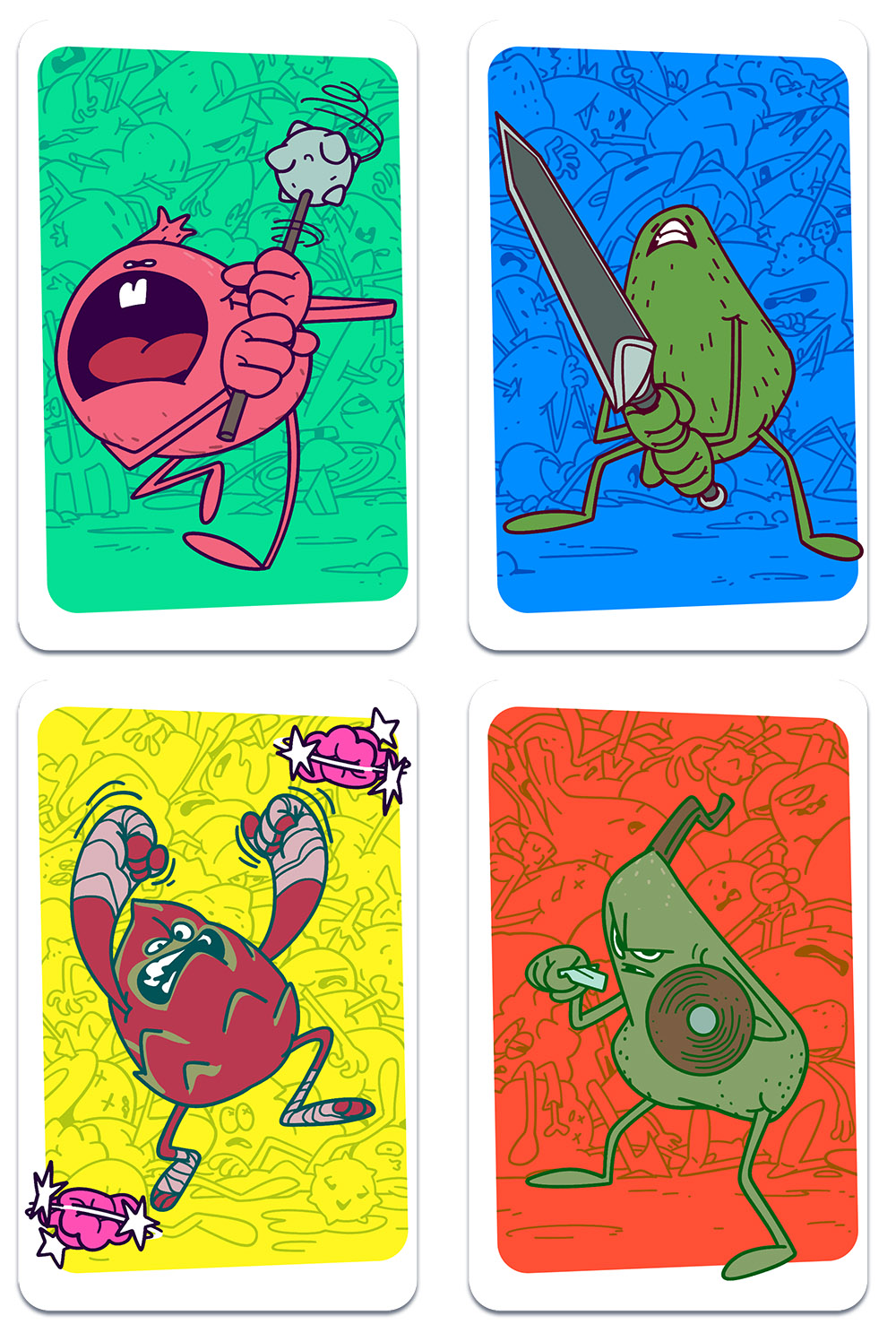
What if I made a card game? It’s battle-focused, very interactive, and the energy level of UNO. I need clearly identifiable colors, easy-to-read central elements, and status indicators. And what if I depict only characters, but all the characters are fruits? And they are all melee combatants, like Pummeler, Blademaster etc., because most fruits don’t…
-
20230126
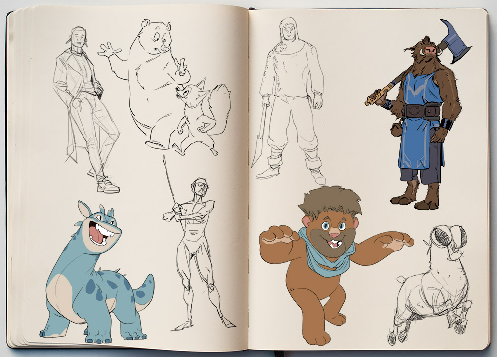
Unfortunately, yesterday didn’t go so well due to a bad headache that’s still persisting. So here are some more random sketches.
-
Stuff I like: Comic – Ultralazer
I just got two volumes of the French comic book Ultralazer, published by Editions Delcourt. The book is created by three people, two of those are the two artists doing the artwork. Maxence Henry drew the characters, while Yvan Duqe drew all the backgrounds. You can see a few pages from the first book and…
-
20230125
The soundtrack while drawing this consisted of:Roque Baños – In the Heart of the SeaPhilip Glass & Paul Leonard-Morgan – Tales from the LoopEmile Mosseri – MinariOscar Araujo – Castlevania: Lords of Shadow
-
20230124
-
20230123 – I like the way you dance
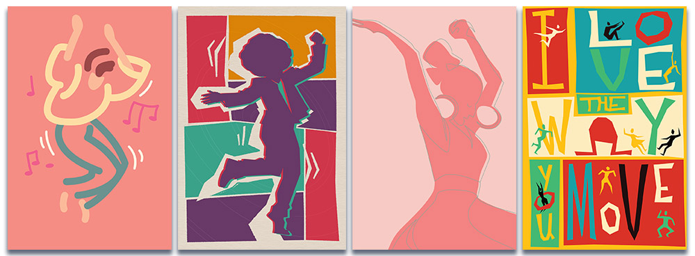
TLDR: Every now and then, I leave my wife a note on her desk with a compliment or anecdote on why I love her. I did that again last Saturday, and it inspired me to do some postcard designs. I’ll talk a bit more about the cards and process; if you want to read that,…
-
20230120
I sat down yesterday with the intent of drawing some Pulpy Logotypes. The one logotype I have was the last thing I drew on these two pages. I got sidetracked a little bit. I don’t know what it is about iterating on one thing past the “I’m out of ideas”-threshold repeatedly that appeals so much…